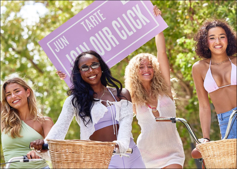
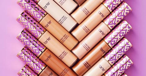
Tarte Cosmetics
UI/UX & Art Direction
UI/UX Designer
Art Director
Brand Designer
Debbie Ortigoza
Team
Role
Project Type
Duration
Digital Product Design
3 Months
Objectives and Goals
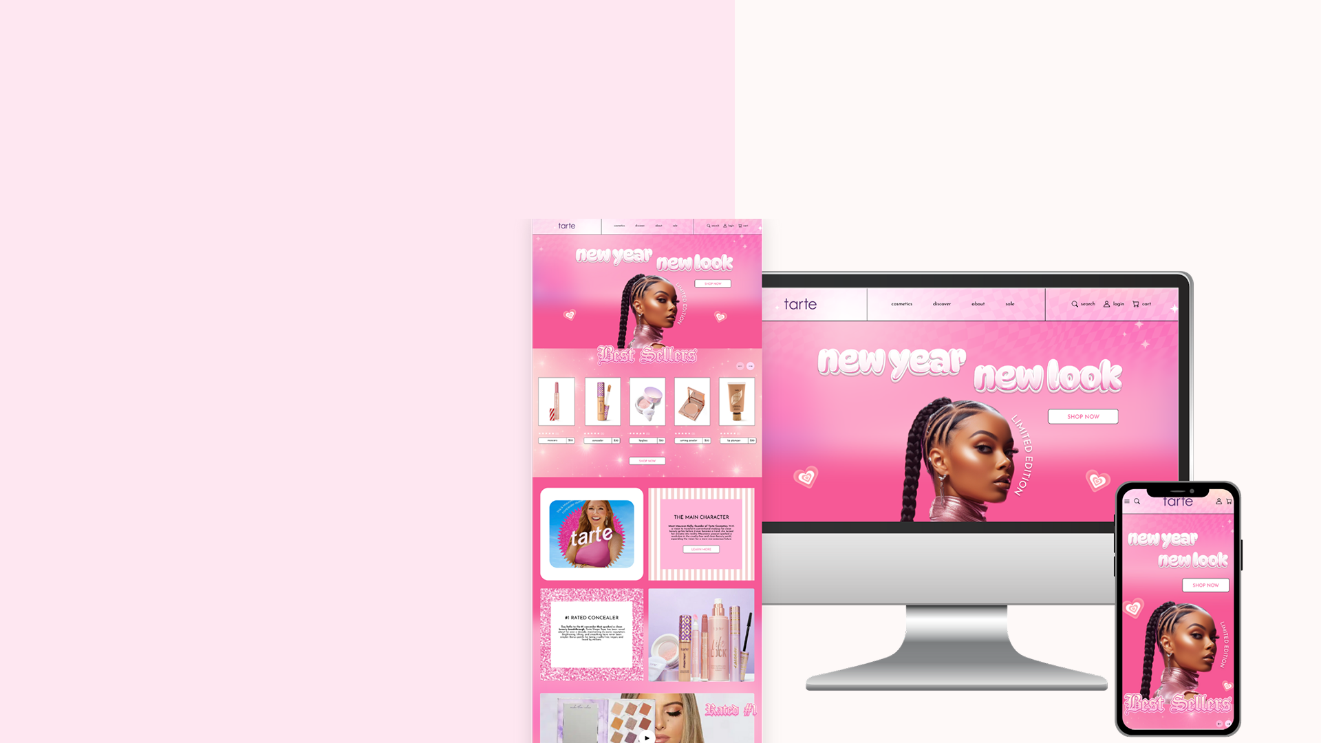
Develop a professional UI design system that feels refreshed and modern
Simplify components and design elements for cleaner interface
Enhance the user-experience by adding icons that align with the brand identity
Redesign the website using an updated visual system specifically for the limited version
Enhance accessibility by adding a fully functional Dark Mode system
Organize the product page to reduce visual clutter
Problems
Outdated UI Design – Feels like a 2016 interface
Product Overload – Cluttered and overwhelming
Dark Mode Issues – Poor contrast and readability
Heavy Promotions – Random ad placements
Weak Hierarchy – Content not clearly prioritized
Unbalanced Grid – Inconsistent spacing and alignment
Cluttered Navigation – Too many menu sections
Unclear Product Pages – Poorly organized information
Poor Mobile UX – Not optimized for mobile
Untrustworthy Reviews – Feels overly curated
Inconsistent Brand Identity – Lack of cohesion for Tarte Cosmetics
Solutions
Modern UI Design System – Refreshed and on-trend
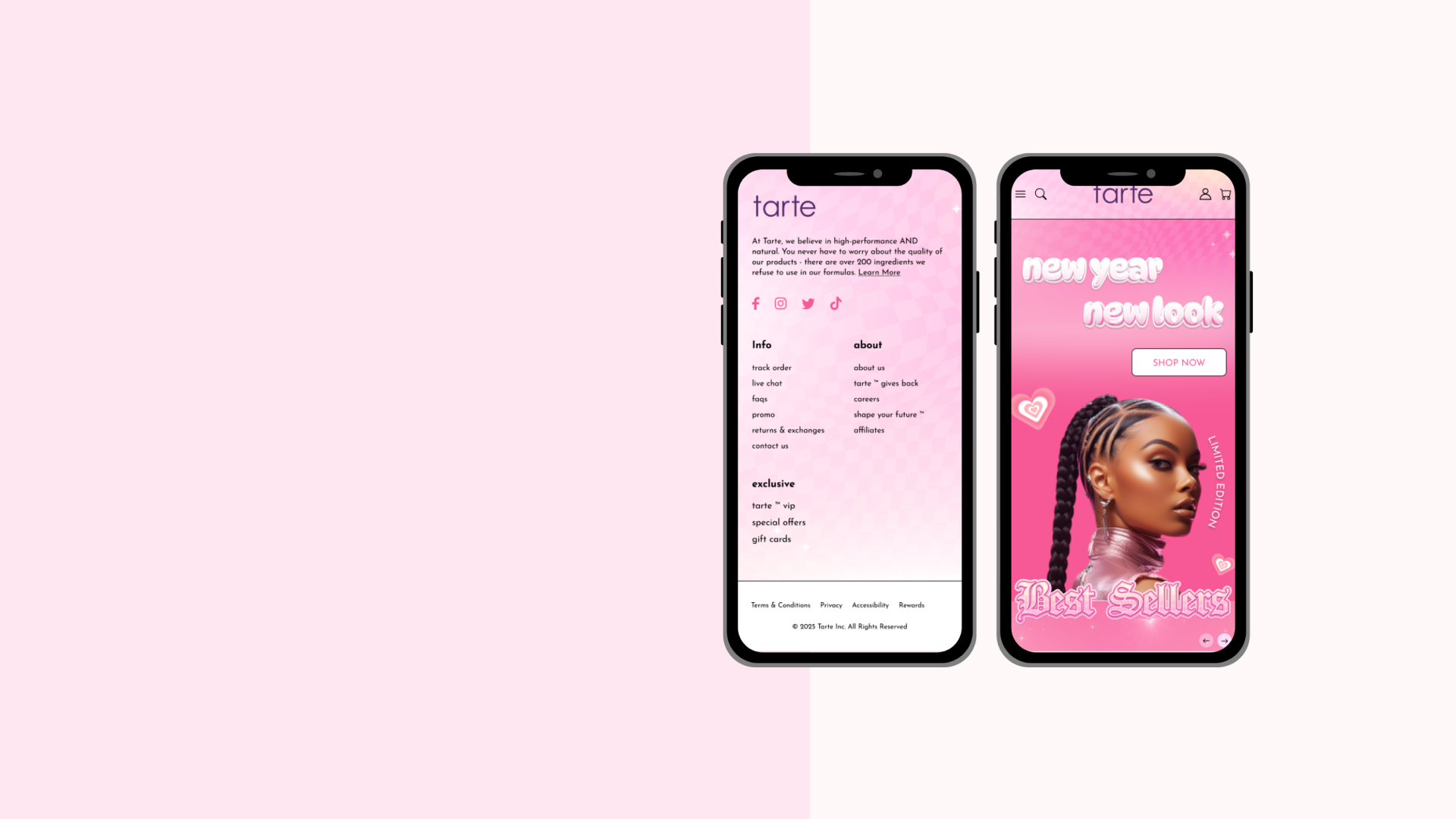
Simplified Navigation – Clear, minimal, and organized
Improved Dark Mode – Cleaner and more accessible
Enhanced Social Proof – Better integration with social platforms
Real Customer Testimonials – Ratings and thumbs icons for clarity
Balanced Grid System – Improved alignment and spacing
Clear Product Pages – Organized with contextual icons
Consistent Brand Identity – Strong and cohesive visuals
Mobile Optimization – Improved usability on mobile devices
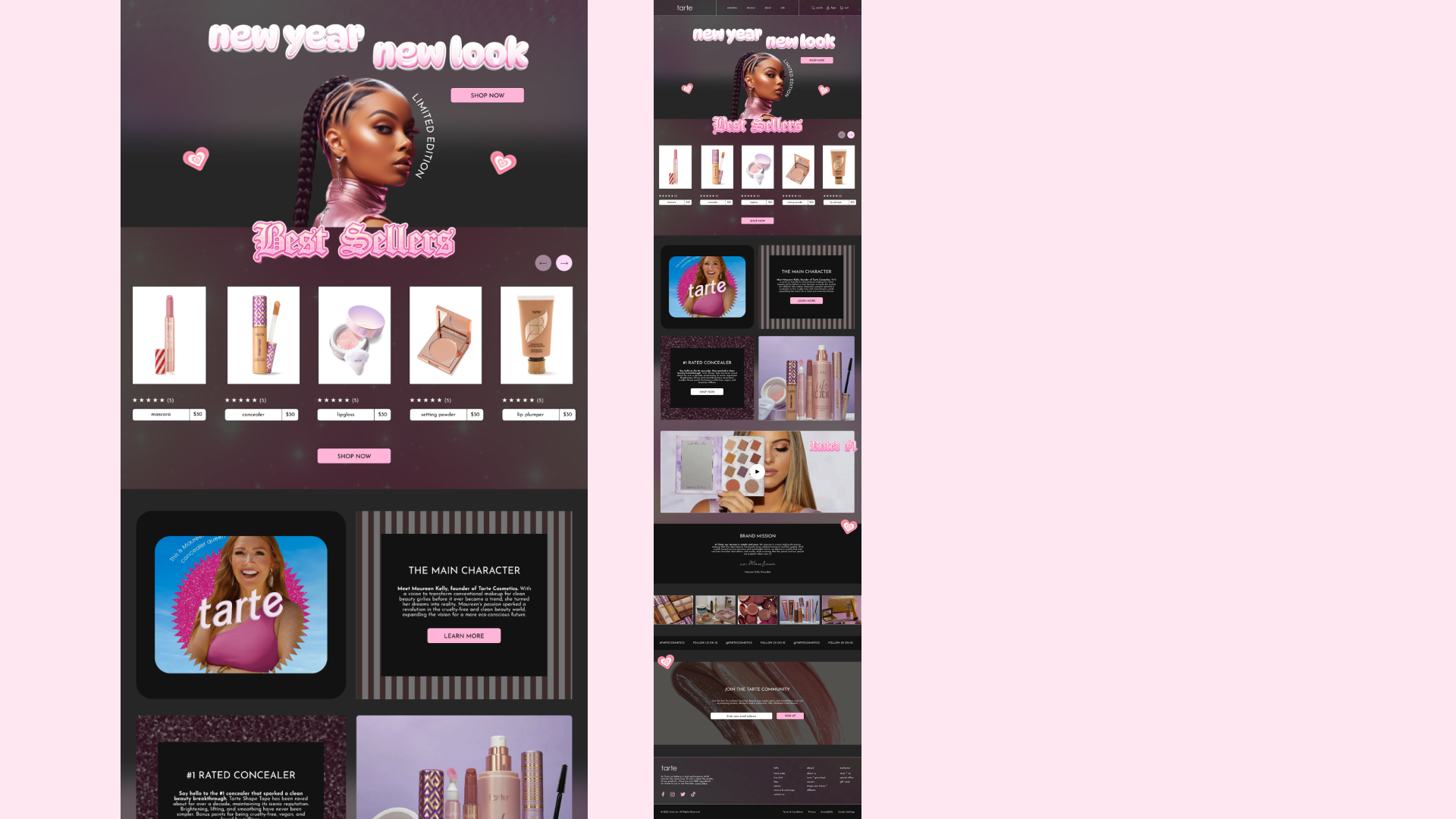
UI Design
Mobile Version
Key Highlight
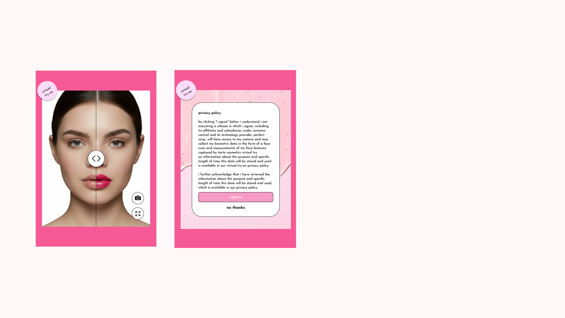
Virtual Try On
To enhance the overall user experience, I introduced a more engaging feature that allows customers to digitally test makeup products before purchasing. This interactive tool helps users better visualize how products may look on them, creating a more confident and enjoyable shopping experience.
Although Tarte Cosmetics already offers a virtual try-on feature, the existing design felt generic and visually disconnected from the brand. I redesigned the interface by incorporating custom icons for the try-on button and introducing branded visual elements, including a soft pink background and cohesive styling. These updates align the feature more closely with the brand’s feminine, playful identity while making the interaction feel more polished and visually engaging.
Key Highlight
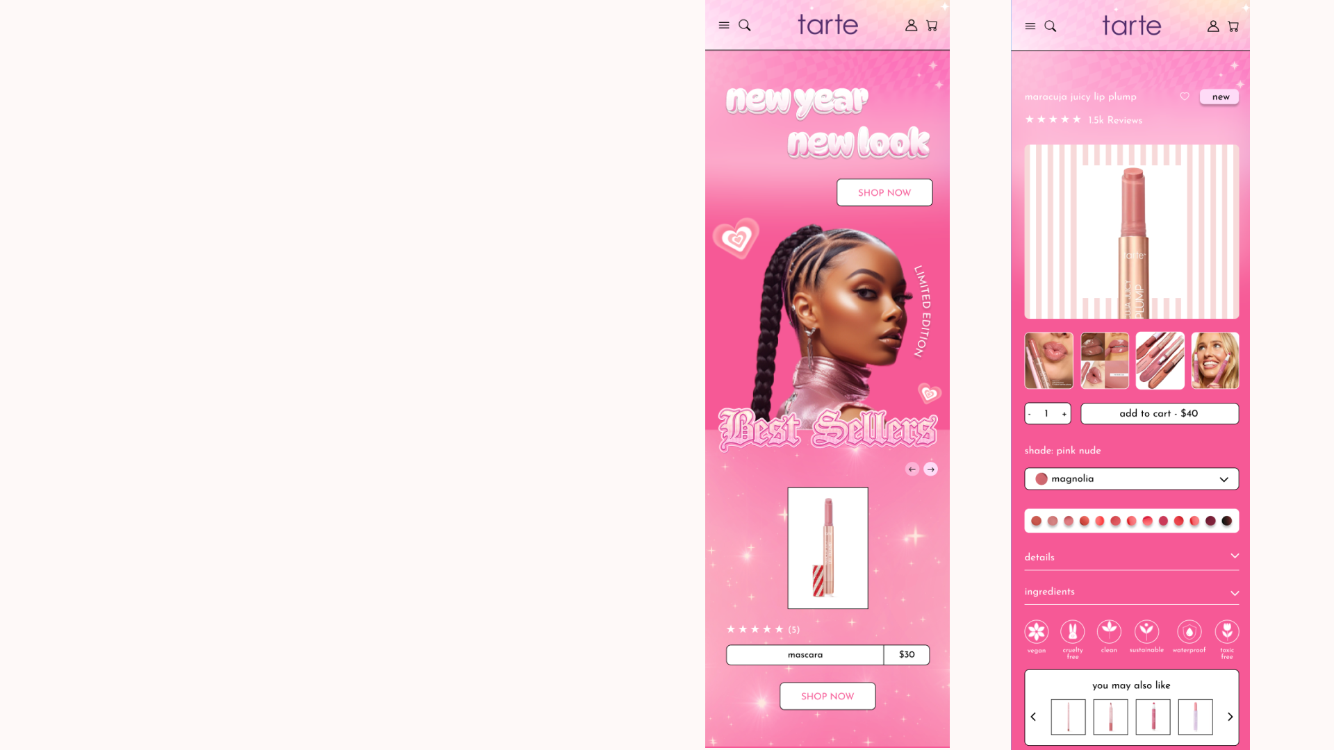
Product Cards
The old structure of their product cards appeared cluttered and unrefined making the whole layout lose its quality. I enhanced the layout and overall aesthetic but making the product card stand out in a visually appealing way.
The original website showcased their products in a boring way, using just a white background. I upgraded it by adding appealing striped patterns that add a feminine vibe, helping the products stand out more for consumers who are shopping.
Watch the Prototype
Mobile Version
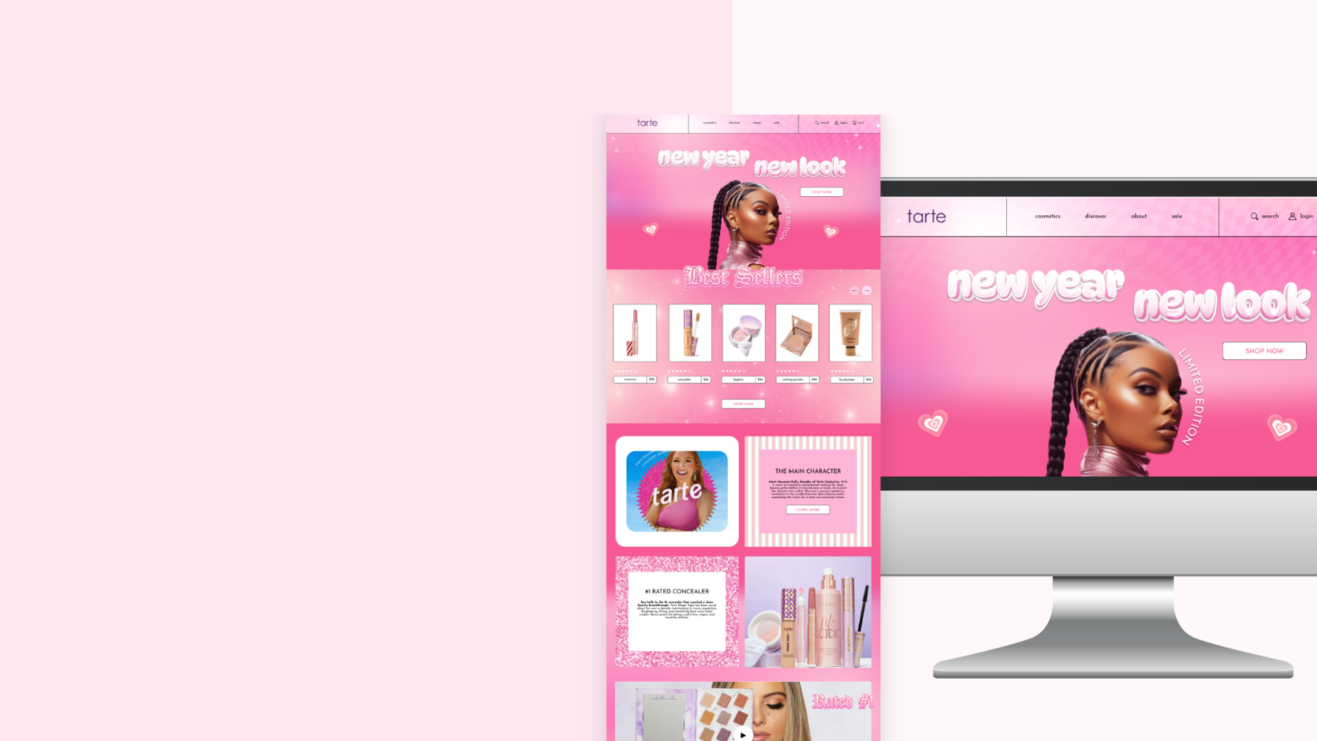
UI Design
Desktop Version
Watch the Prototype
Desktop Version
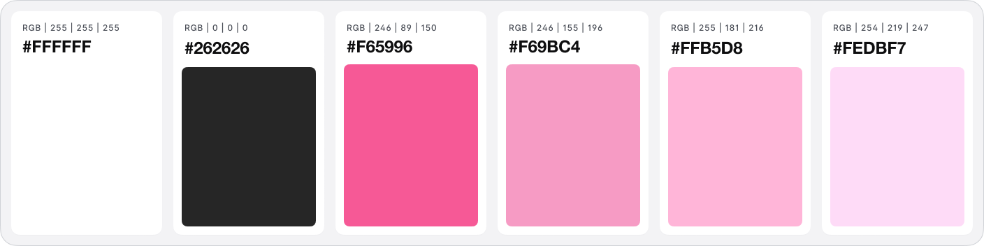
Color Palette


Dark Mode
Desktop Version
Reflection
This project helped me better understand the complexity of UI/UX design, especially when developing a structured design system. While the process requires patience and attention to detail, the part I enjoyed most was the creative direction. Reimagining Tarte Cosmetics’ brand identity for a limited-edition concept allowed me to experiment with a playful, refreshing visual approach while still maintaining the brand’s recognizable personality.